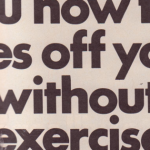
We see this everywhere at some point towards the latter half of the 1960s. Helvetica font runs rampant. It’s everywhere: in the LIFE copy, in the ads. It permeates other publications, as well, but rarely as much as in LIFE.
Not only that, but lower case. It’s more of that faux humility. Helvetica is a very fake-humble typeface, almost pretentious in its lack of artifice.