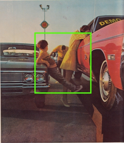
At some point in the mid-1960s, we start to see non-centeredness. This ad for Chevrolet “OK” Used Cars from 1968 is a prime example. The green box has been added by me.
What’s at the center? Usually, the most important information is at the center of the image. But here we’ve got a bored kid who is leaning against one of the products that are being advertised. The Mom is half-heartedly peeking into the window of the red car (which is halfway cut out of the picture). Dad is fuzzified in the background doing…something. It’s meant to be very “human,” a slice-of-life image.
It’s that fake humility again cropping up that we’ll start to see so much of. It’s that anti-hero posturing that permeates all areas of 1960s culture.
More than anything, it’s saying: Yes, there is a center, but the center is empty and rotten.